Project date: Feb 2022 – Jun 2022
Role: UX Director and UX Researcher at Isadora Agency
Team: 1 Digital Producer | 1 Account Strategist | 1 Product Designer
Project Summary
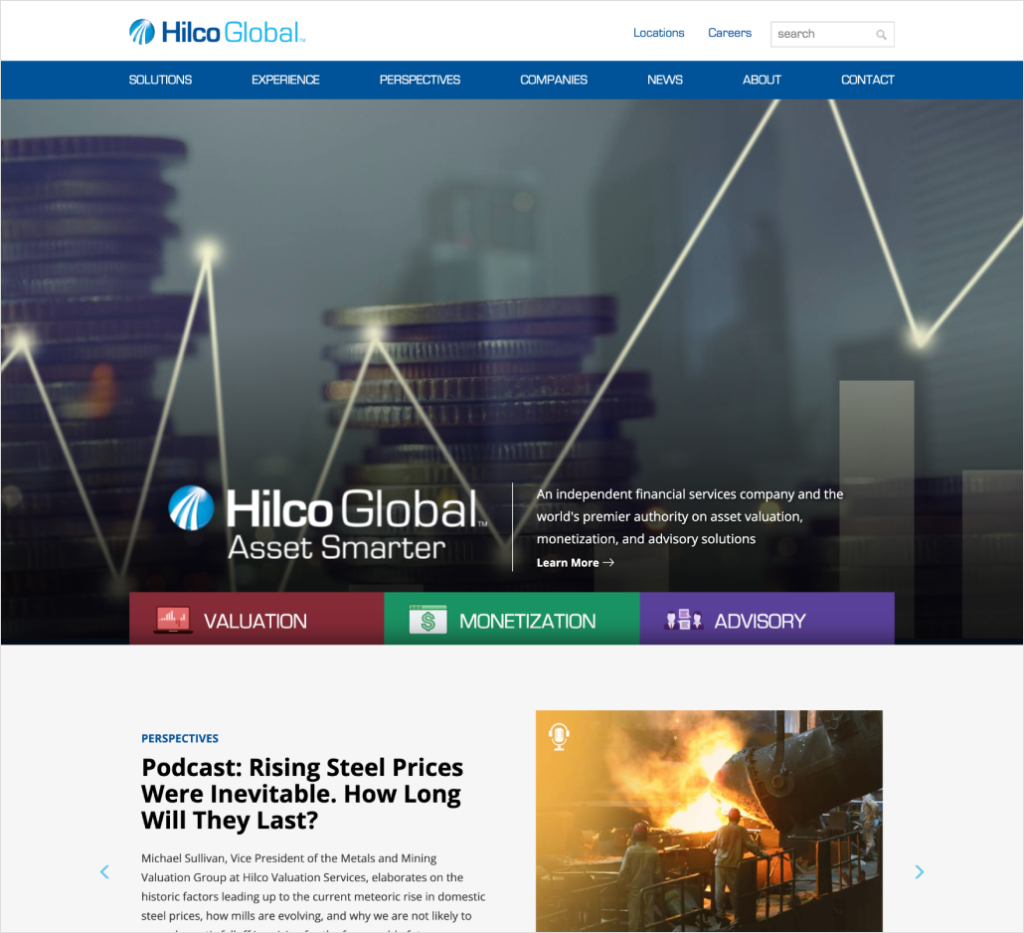
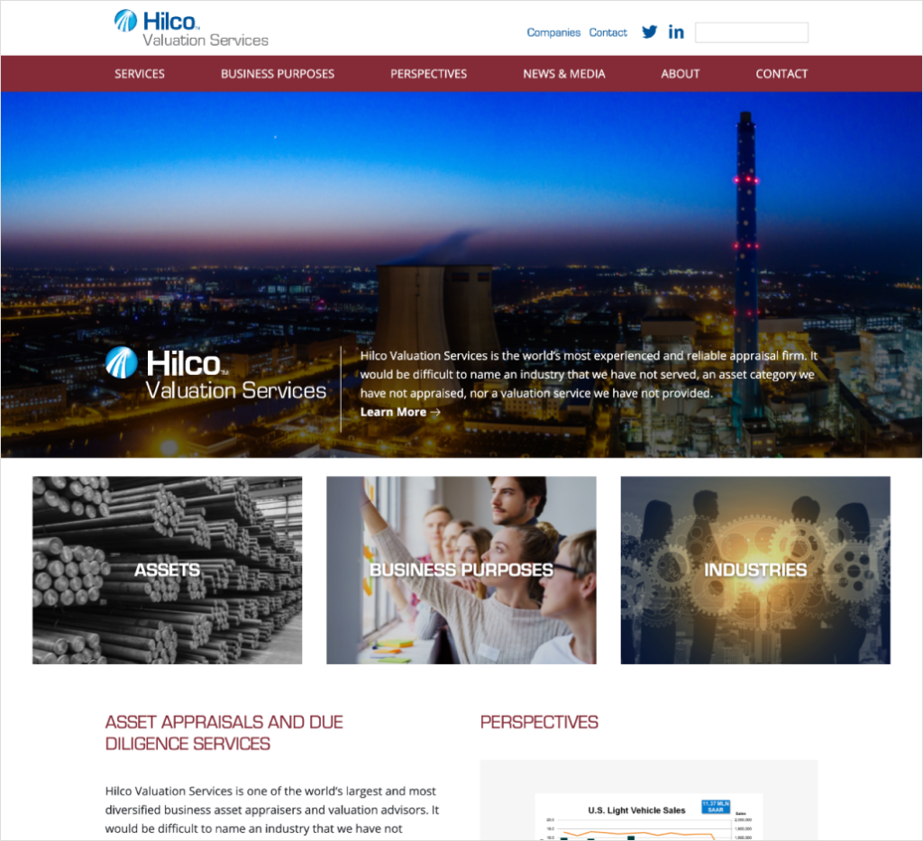
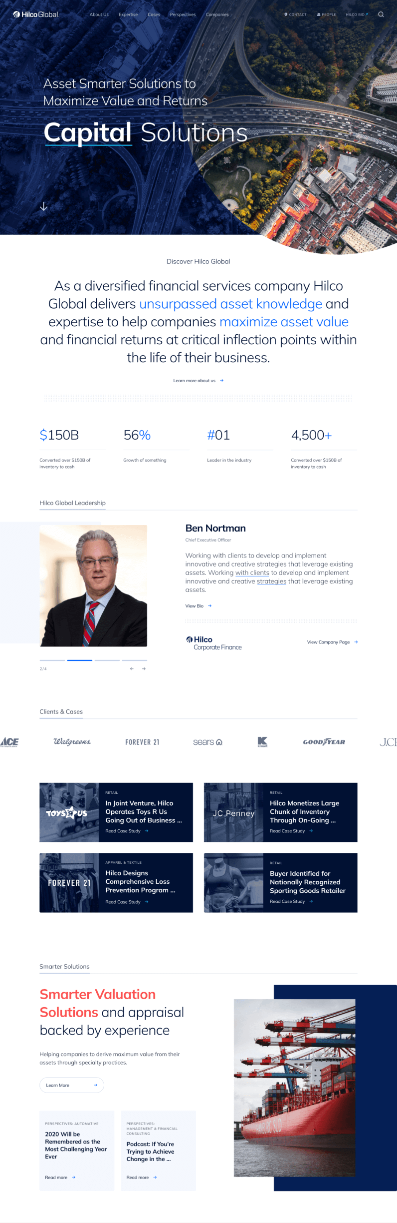
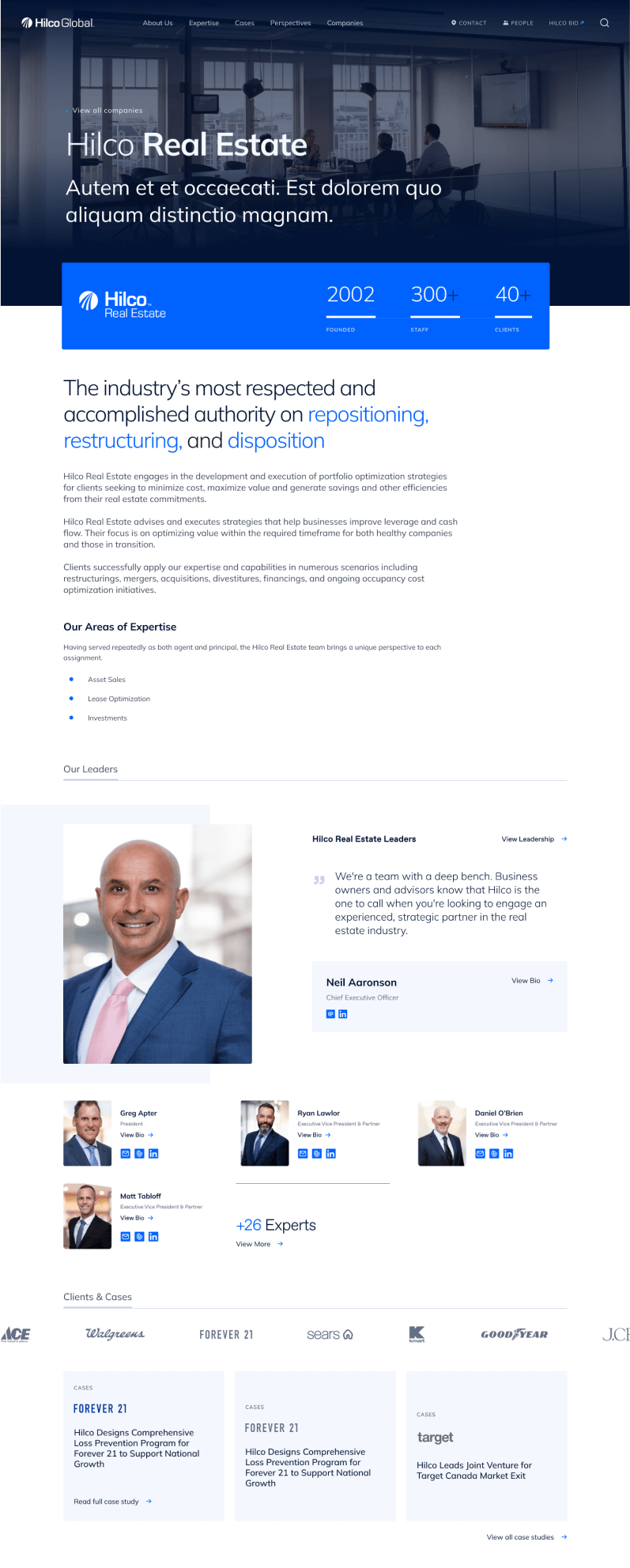
A site redesign for Hilco Global, which is a financial services company with over 20 specialized operating companies (OpCo’s) under its umbrella. They are the authority on maximizing the value of assets for health and distressed companies, providing a broad range of services customized to resolve their clients’ challenges.
The Challenge
Their goal was to
- Design a visually compelling site to reinforce Hilco’s brand
- Provide the ability to quickly and easily navigate through information
- Feature Hilco’s content and connect it to relevant people and services

Discovery
Stakeholder Interviews
First we needed to learn what was important for the client, and gain a better understanding of Hilco Global’s business and its unique relationship with its OpCo’s. Additionally, we solidify the project’s goal. To do so, we interviewed C-level executives and key executives across Hilco Global and selected OpCo’s—the experts.
The key items we learned:
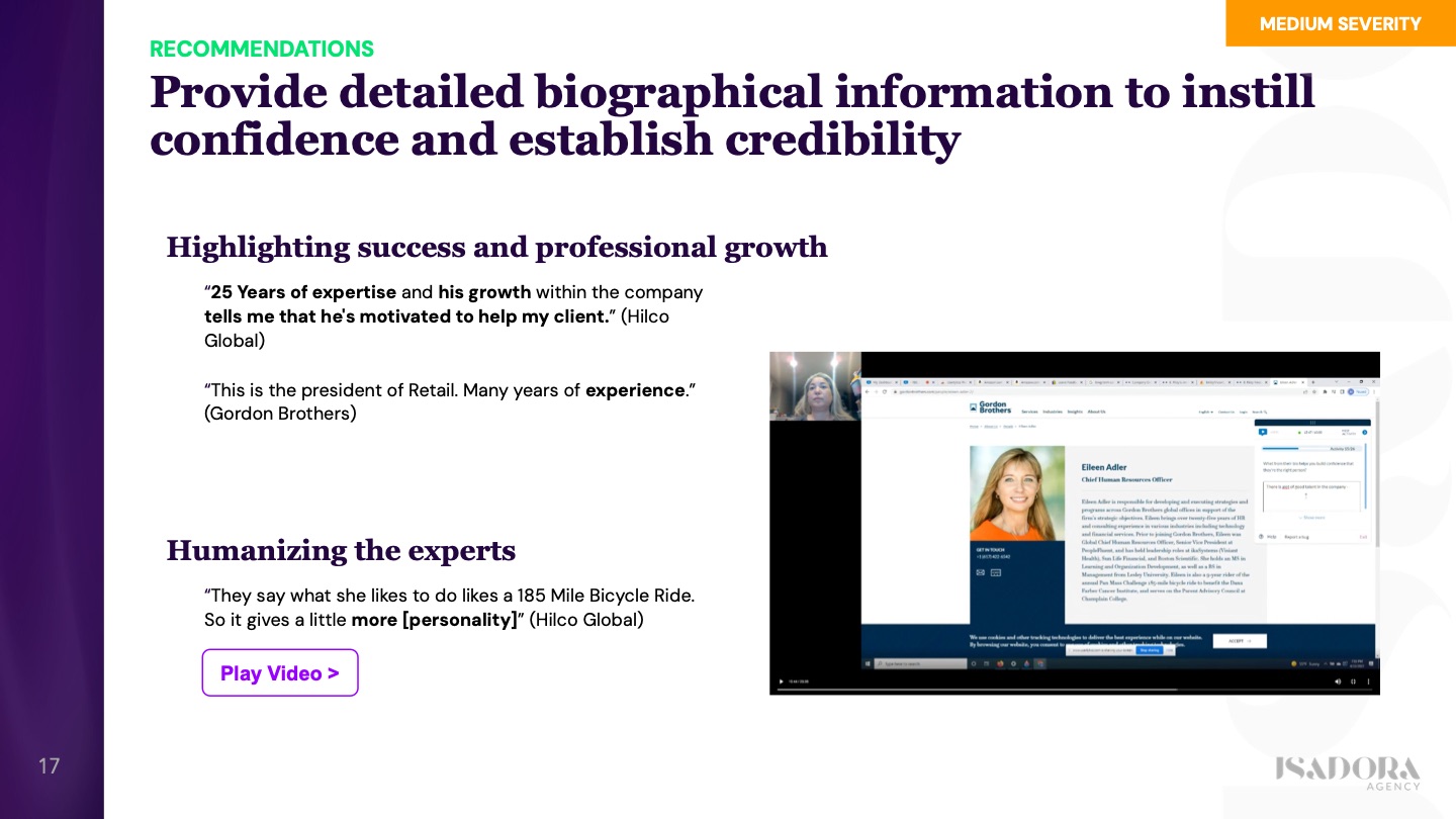
- They needed to be able to build trust and credibility through their case studies and the leadership team’s experience and expertise
- They have a lot of good data and content, but it was badly organized and very text-heavy
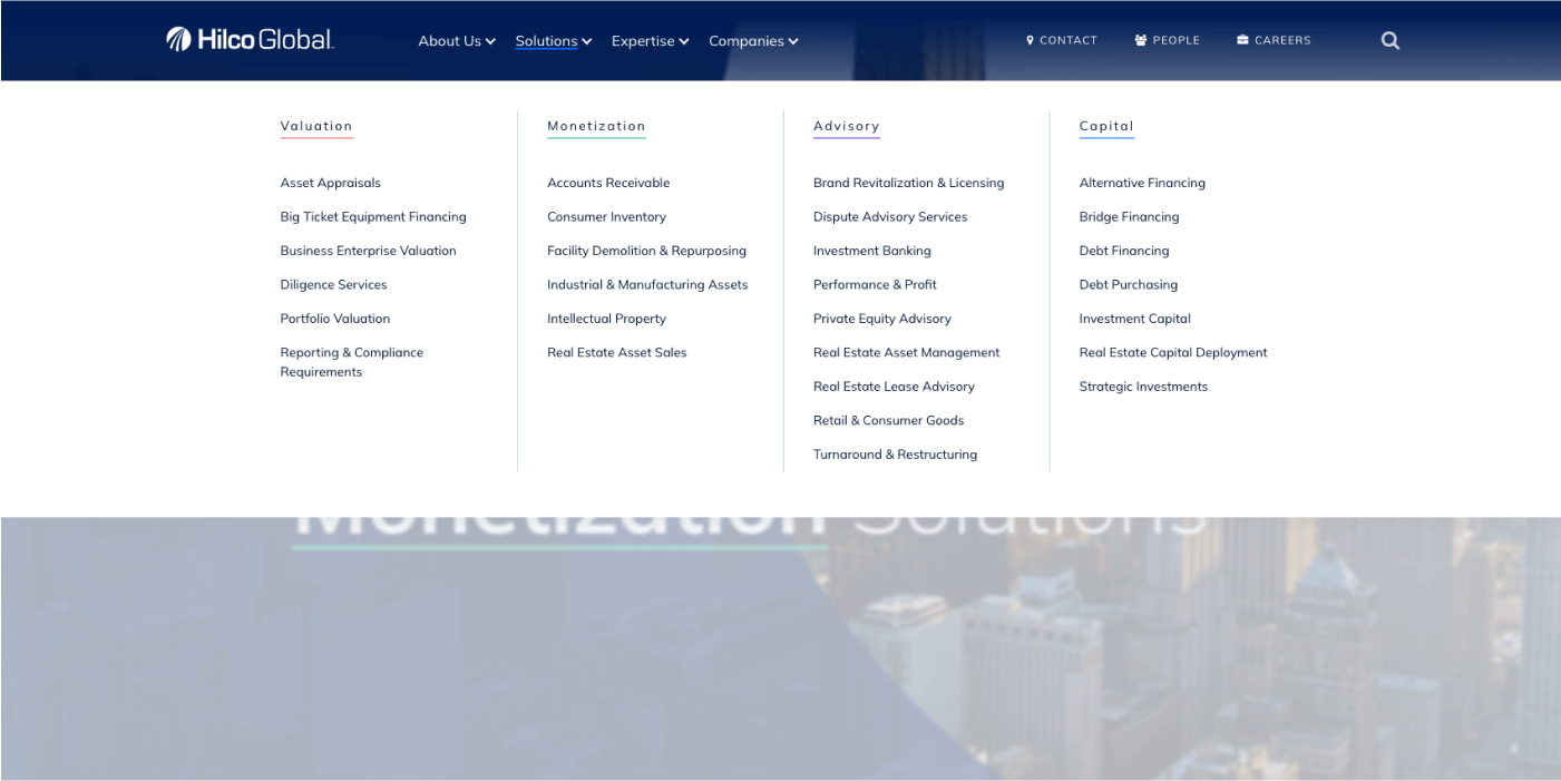
- The sites are very siloed and very limiting in how they present a disjointed experience, which doesn’t support presenting highly customized solutions for their potential clients
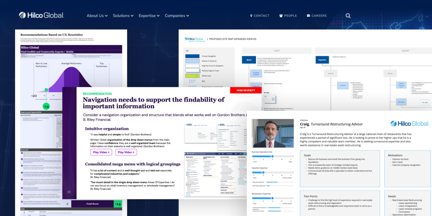
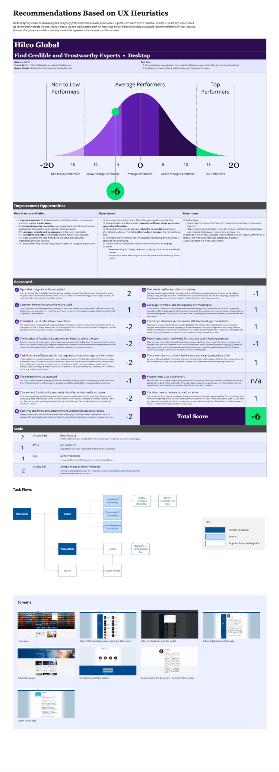
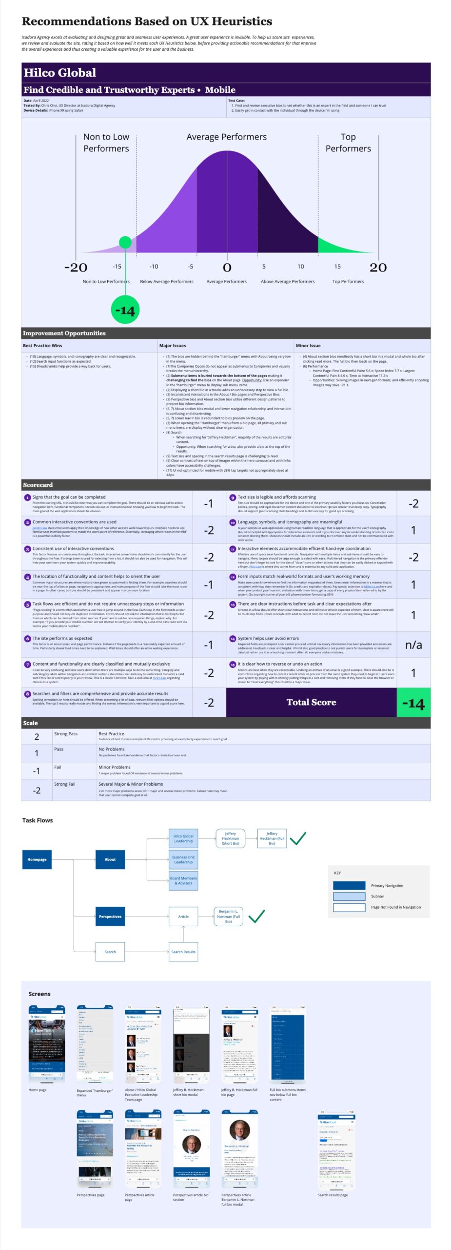
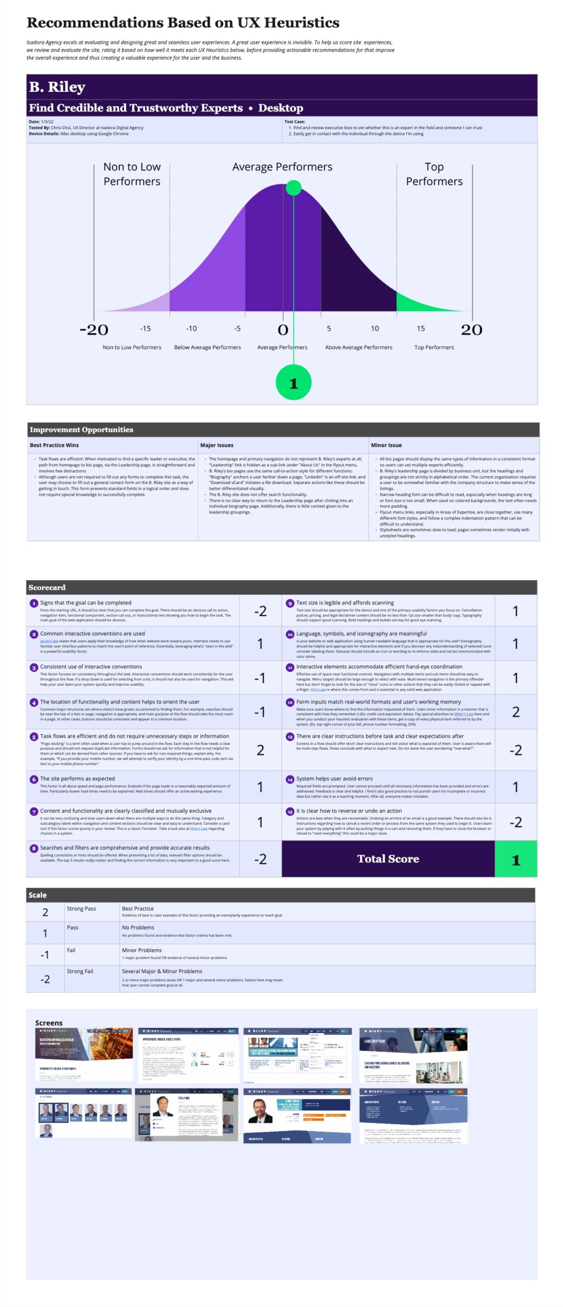
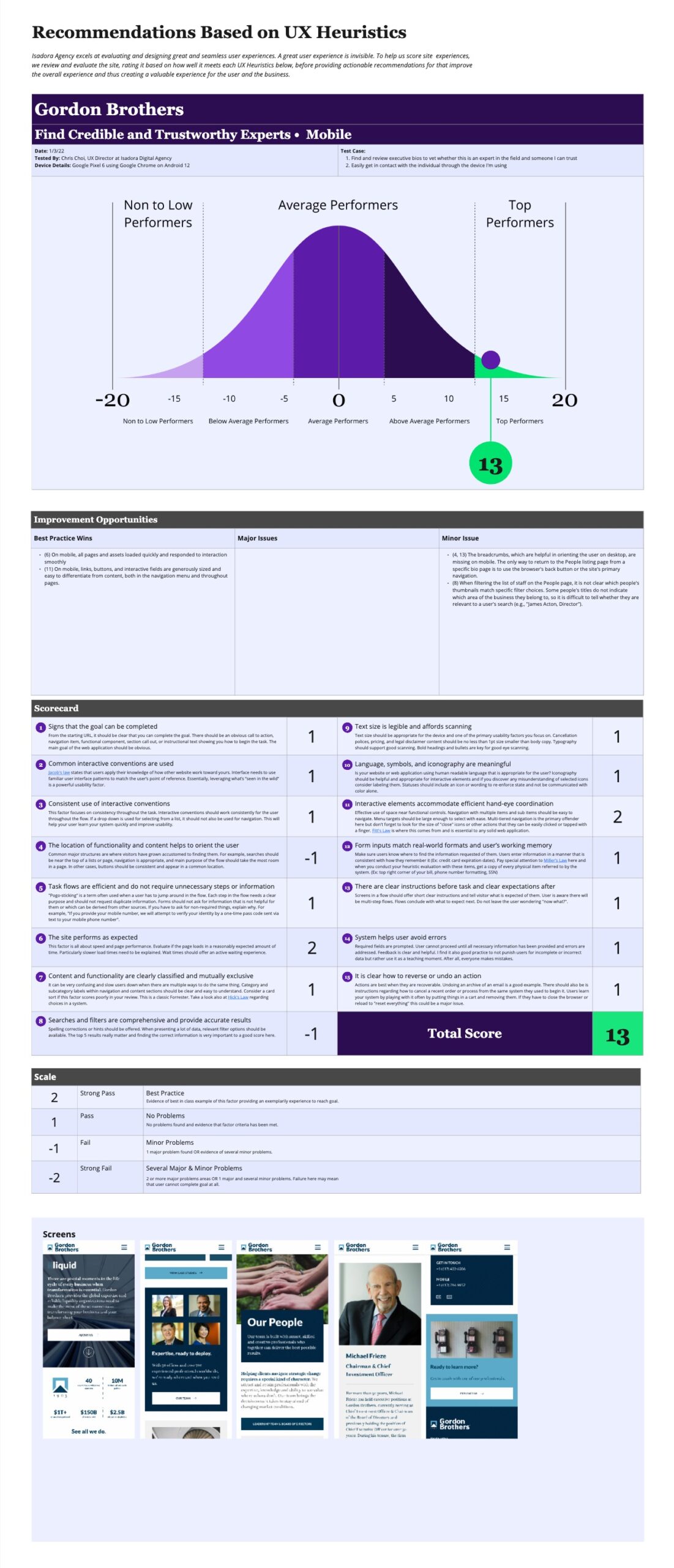
Heuristic Evaluation
In reviewing their and competitor sites against accepted usability principles, we found that Hilco Global’s site follow best practices for tasks related to locating bios and having clear instructions with call-to-actions. But there were several major issues with redundant navigation patterns and inconsistencies with how information was presented between Hilco Global and its OpCo’s.
B.Riley rated roughly in the middle with straightforward paths with few distractions but a flattened navigation that presents an overwhelming amount of information.
Gordon Brothers is the highest evaluated with a simple and well-structured navigation and a People landing page with useful bits of information and UI elements that help users navigate and filter content.

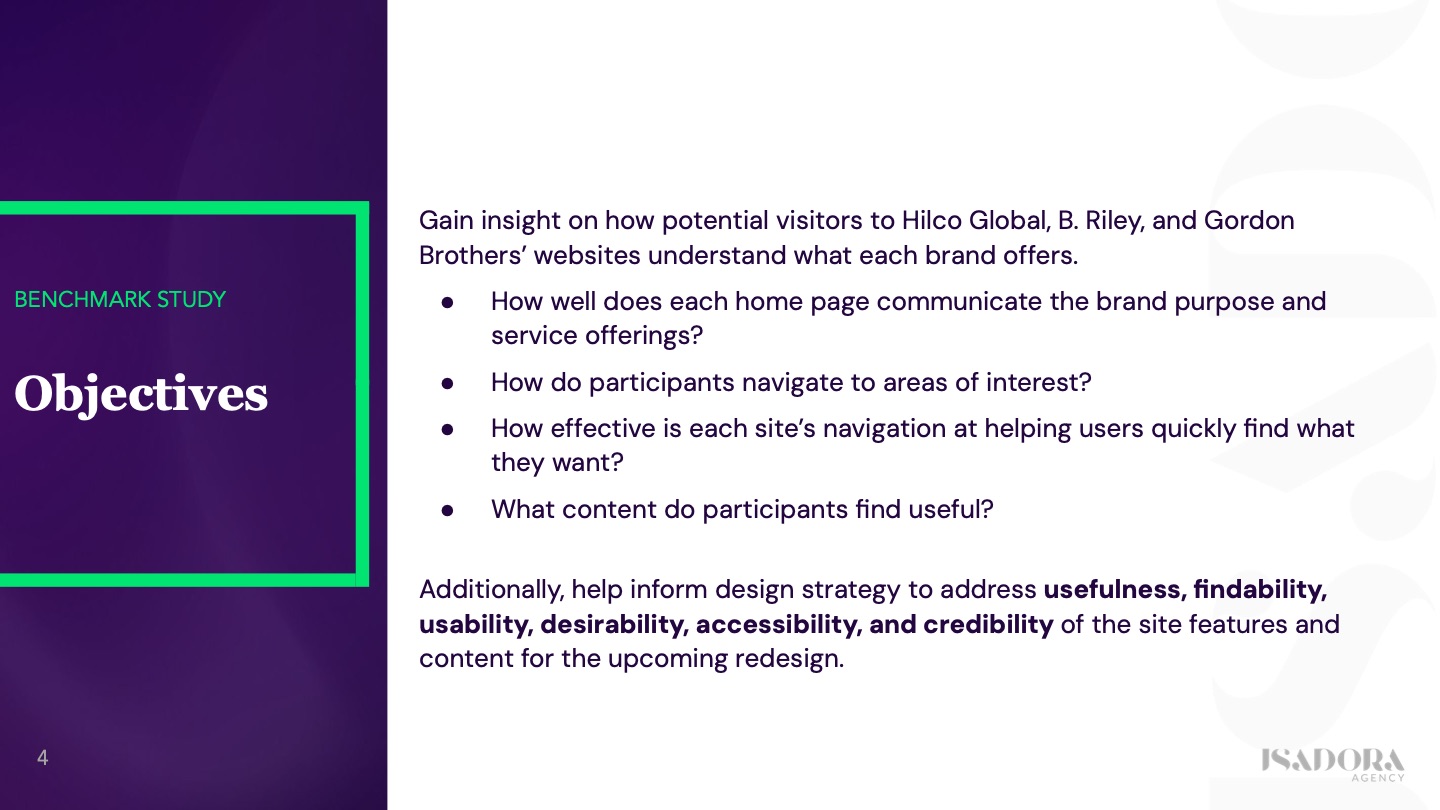
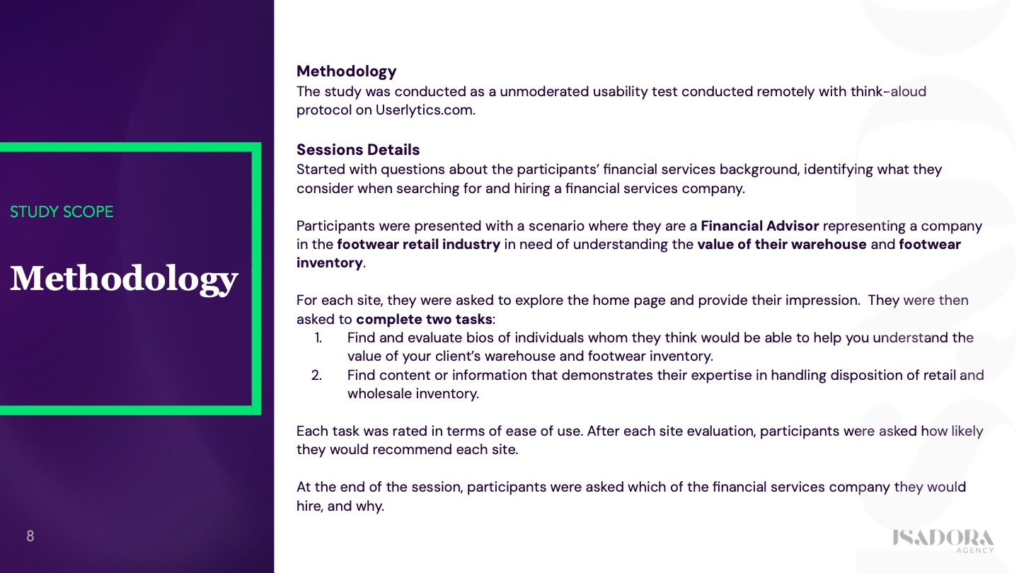
User Research
We conducted an unmoderated remote study to understand what users find useful in determining which organization to partner with. Additionally, to observe how they navigate and interact with the sites to gain insights into new ideas.
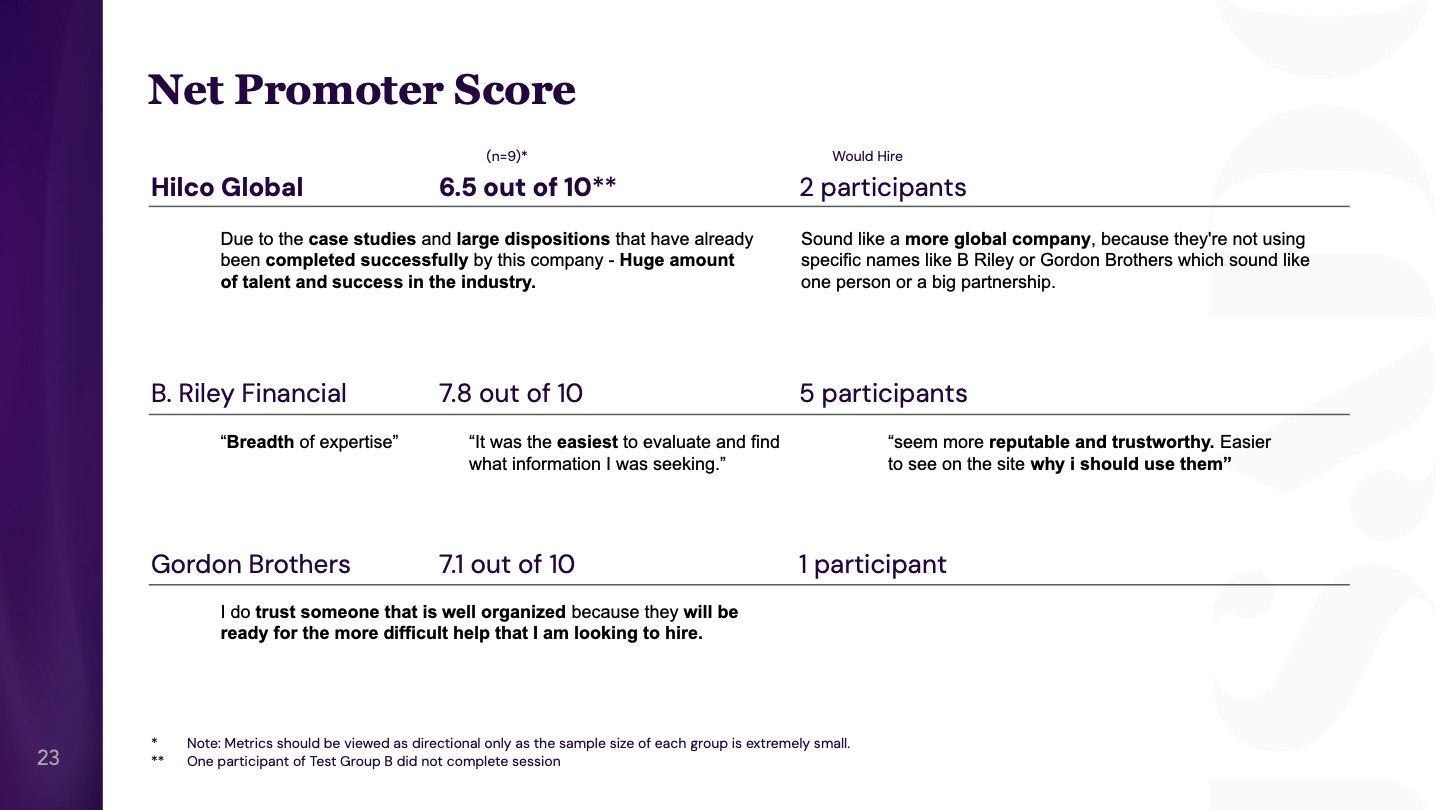
Key Findings:
- Good navigation communicates how your products and services solve people’s problems and help them find important information they need.
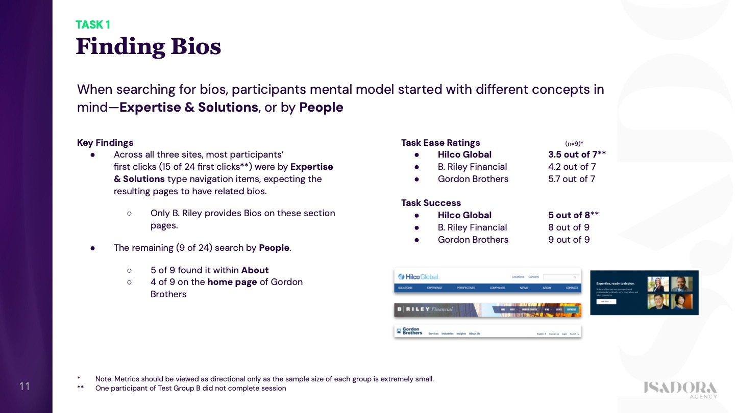
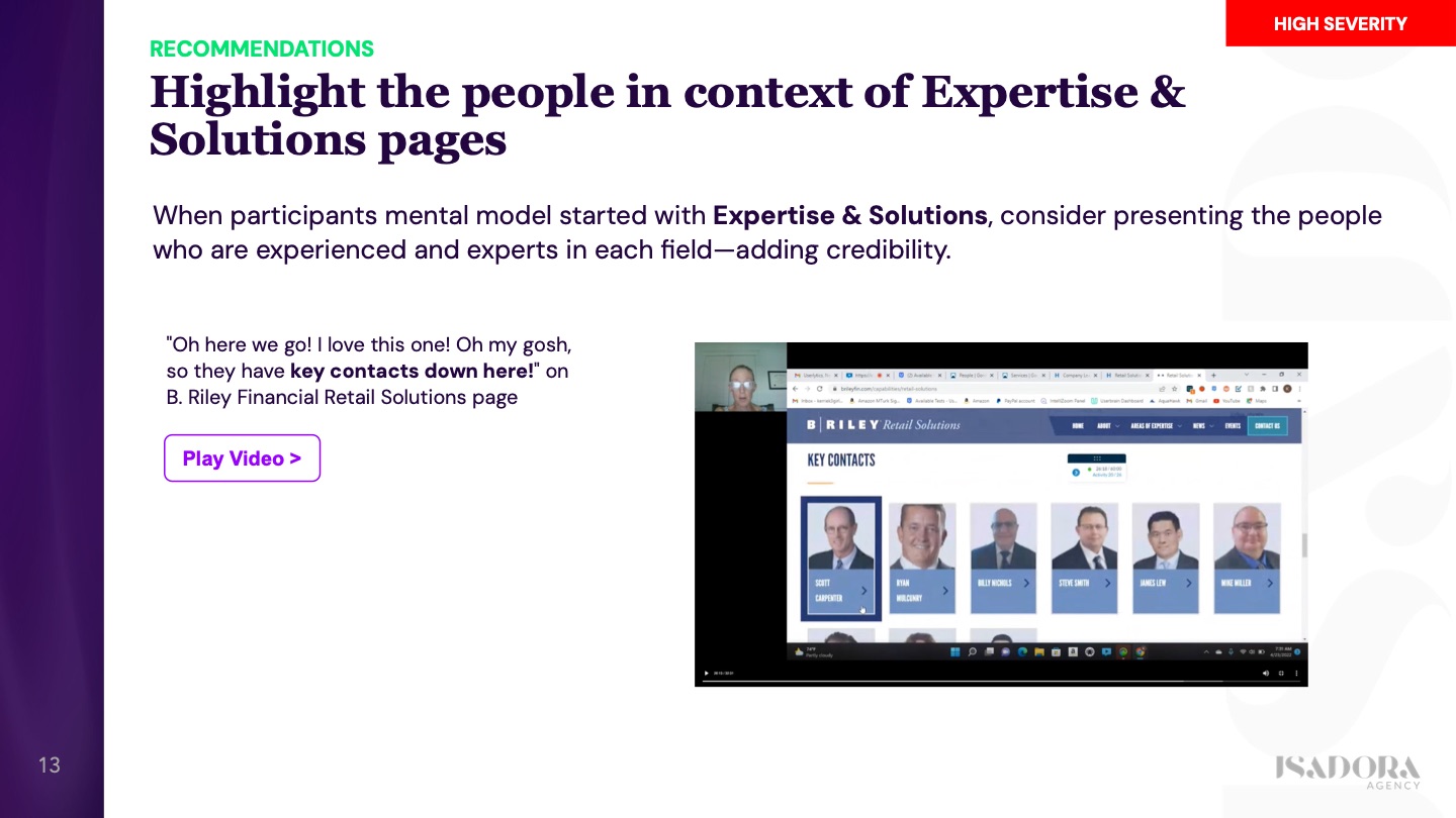
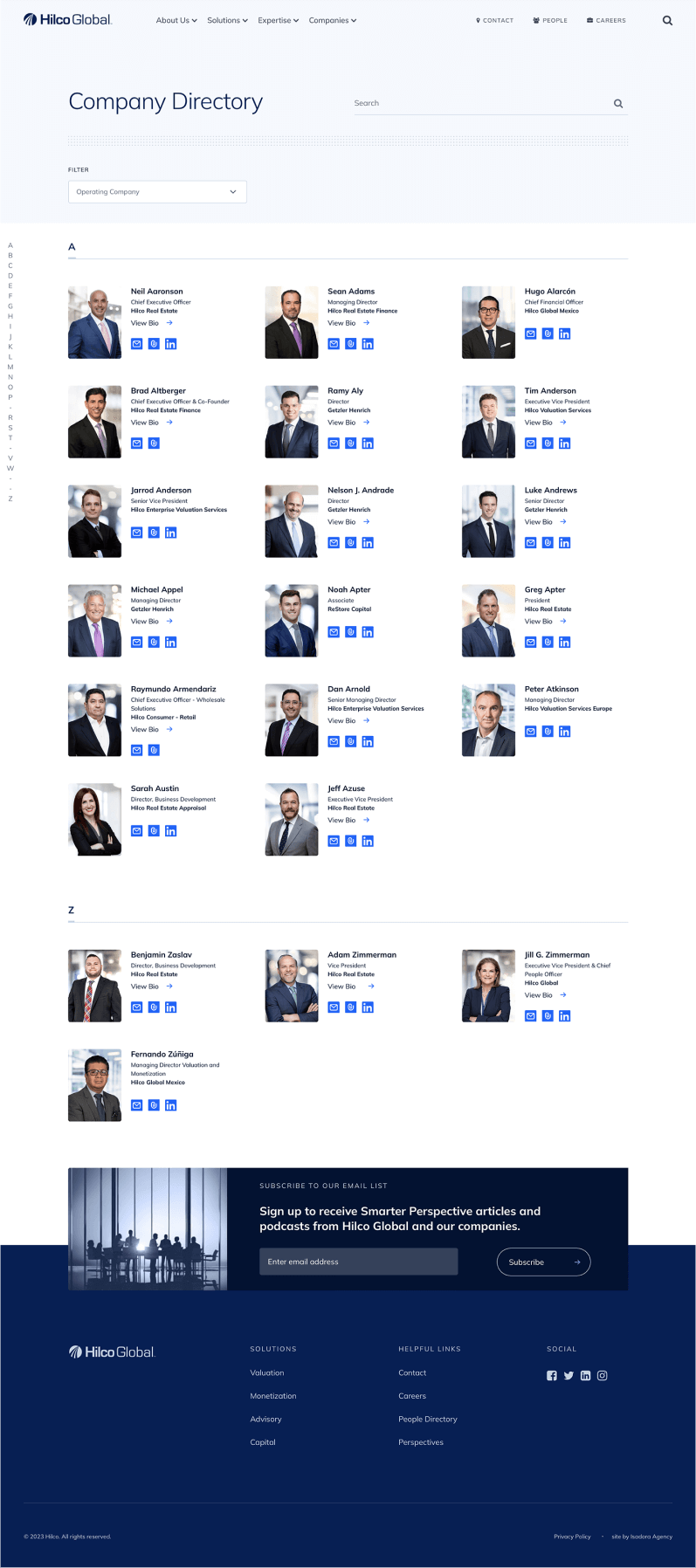
- When searching for bios, participants expected to find them by “People” or by Expertise & Solutions where related bios would be highlighted.
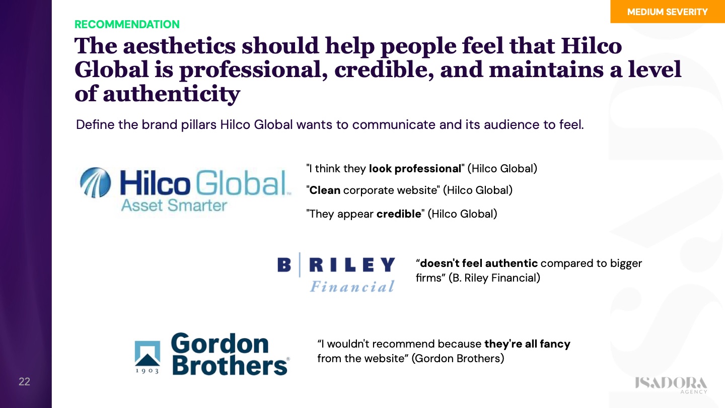
- The aesthetics of the redesign should help users feel that Hilco Global is professional, credible, and maintains a level of authenticity.
The Results
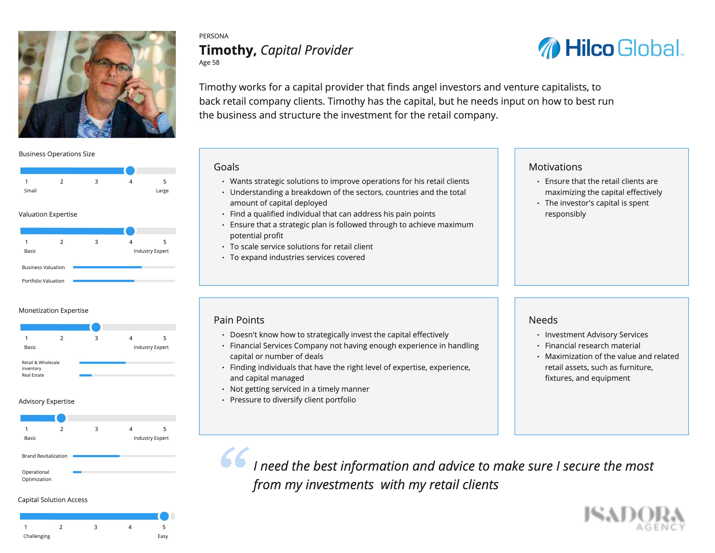
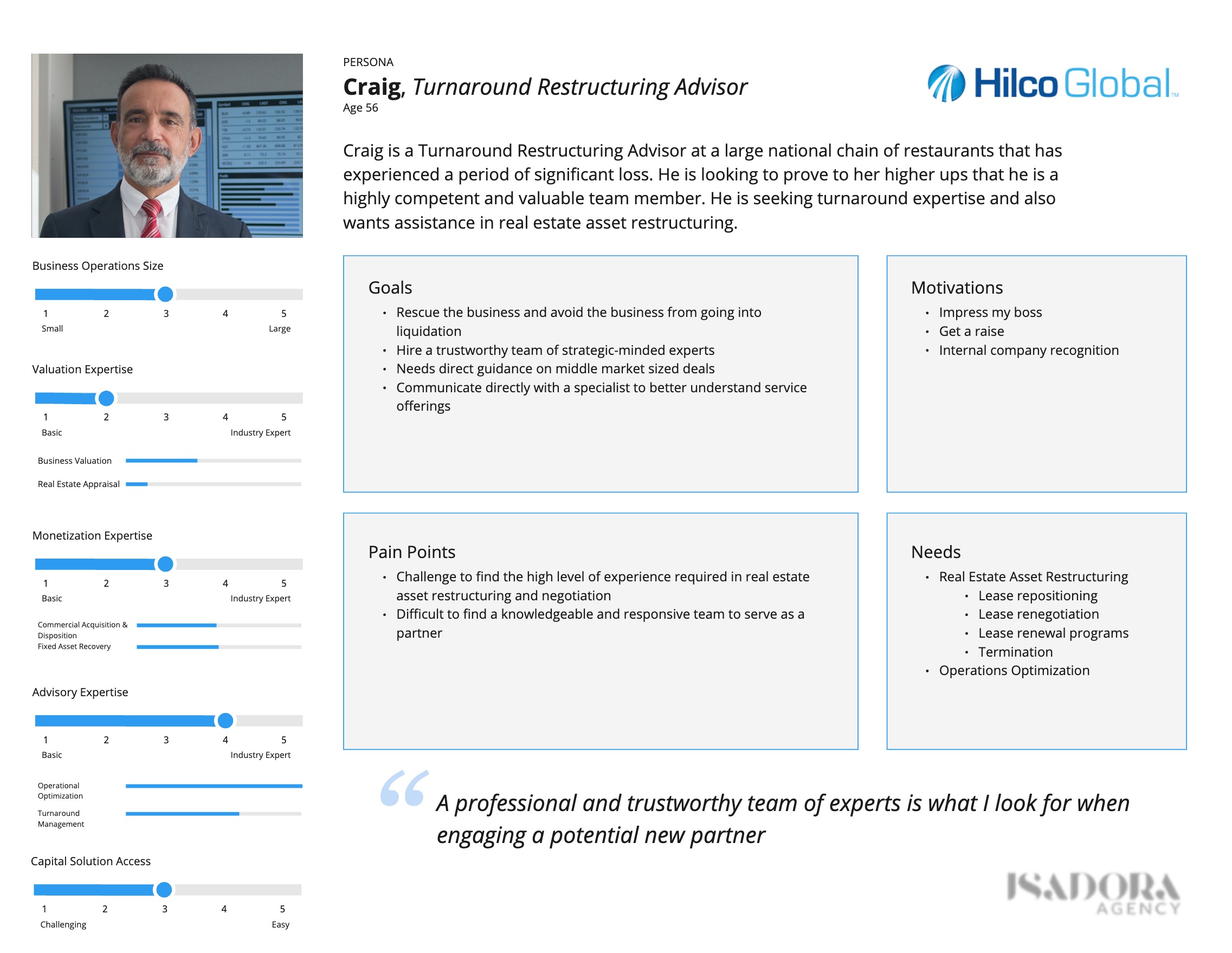
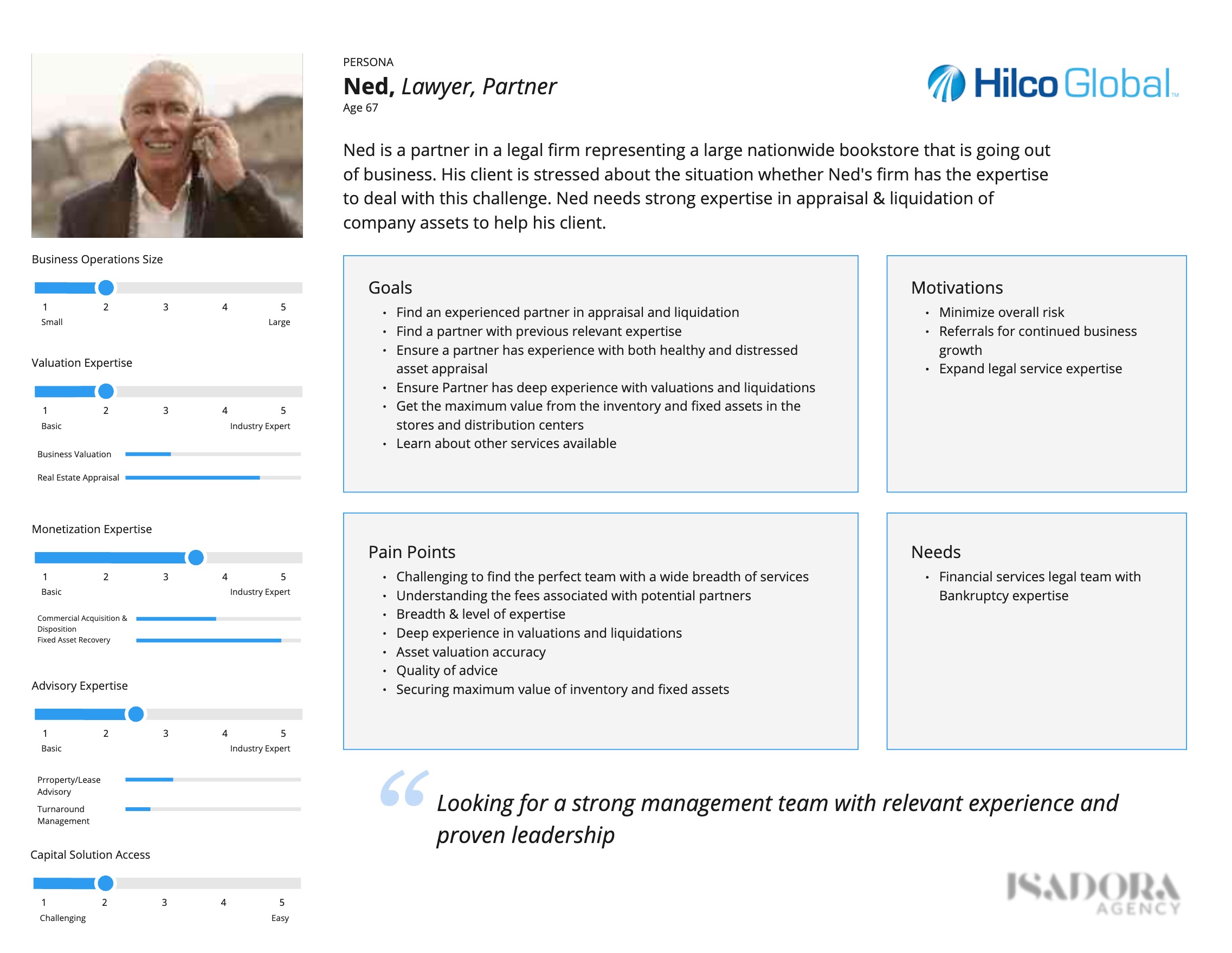
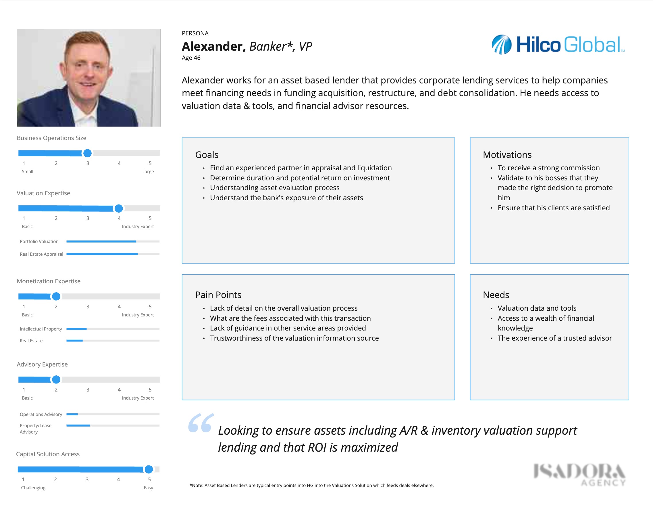
User Personas
Problems Statements and Objective & Key Results (OKR)
| Problem | Objectives | Key Results |
|---|---|---|
| Users need to be able to easily vet Hilco Global and build trust in their experts | Clearly establish Hilco Global as a trusted industry expert and global leader | Lower bounce rate on home page Increase visits to leadership bios |
| Users need clearer, more intuitive navigation and content organization to find appropriate information | Craft a thoughtful site structure and holistic customer journey that encourages repeat visits | Increase pages viewed per session Increase view of editorial content and case studies Increase number of resource downloads |
| The brand’s digital experience is fragmented, preventing users from understanding the full breadth of Hilco Global’s service offerings | Clearly articulate what Hilco Global does as a “house of solutions” rather than a set of discrete operating companies | Reduce exit rate on Solutions pages
Increase page views and path depth within Solutions section |
| The brand design and layout is dated, negatively impacting brand perception | Design a visually appealing website that attracts attention and builds brand affinity | Impression testing with users Improved brand perception from clients |
Information Architecture
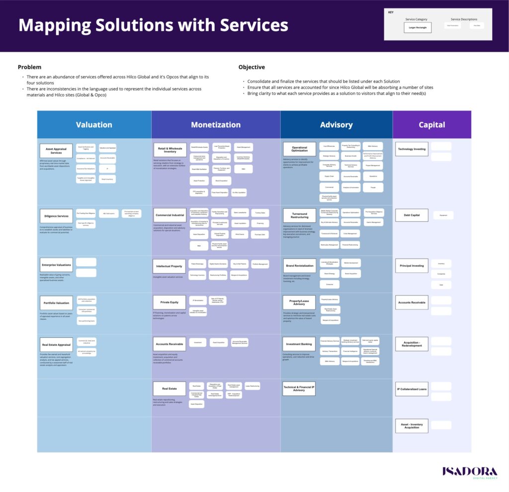
From the insights we gained from discovery, we mapped out the site map, but we still had a challenge with their vast portfolio of solutions and services.
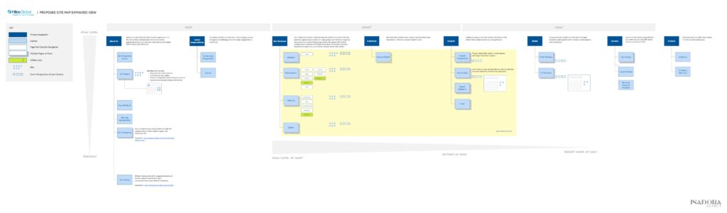
We prepared a Miro board and conducted a workshop with the client to map and define service categories and descriptions under each solution.
Design Solution
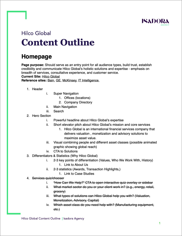
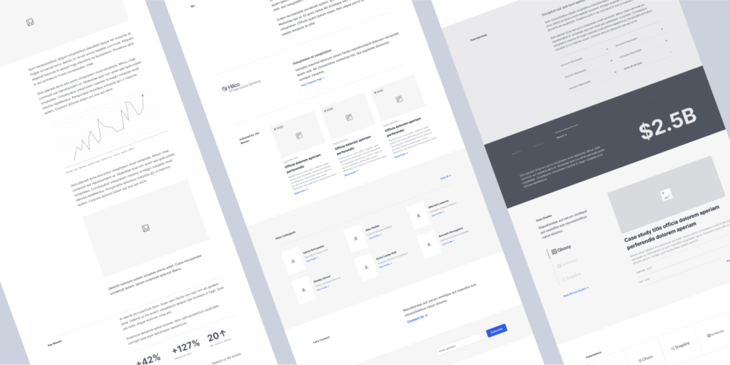
Content Outline
From this, I drafted up the requirements within a content outline, detailing the purpose of each section, the contents, and features for the designer to wireframe and design.
The Outcome
The redesigned site launched May 2023.
Hilco 3 Month KPI Report
- Consolidating the various Hilco sites into one entity was a success having increased traffic from multiple sources of 171% following its 5/9/23 launch.
- Users also appear to be more engaged showing a total interaction increase of 77% with more traffic flowing further into the case studies, services, and editorial content of the site.
- Traffic to key pages that drive conversion such as leadership bios and case studies went up.
- We have seen an increase in traffic, interactions, and events across the board.
| Objectives | Key Results |
|---|---|
| Clearly establish Hilco Global as a trusted industry expert and global leader | Lower homepage bounce rate (General engagement rate is up 7%) Increase visits to leadership bios (/leadership visits are up but tracking issue prevents full analysis) |
| Craft a thoughtful site structure and holistic customer journey that encourages repeat visits | Increases pages viewed per session (We have seen an increase in overall page views but a decrease per session of 34%) Increase view of editorial content and case studies (/case-studies up 390%) Increase number of resource downloads |
| Clearly articulate what Hilco Global does as a “house of solutions” rather than a set of discrete operating companies | Reduce exit rate on Solutions pages (Requires custom report build) Increase page views and path depth within Solutions section Design a visually appealing website that attracts attention and builds brand affinity |
| Design a visually appealing website that attracts attention and builds brand affinity | Hilco 3 Month KPI Report Impression testing with users (Pending future testing due to need to launch prior to UAT completion) |